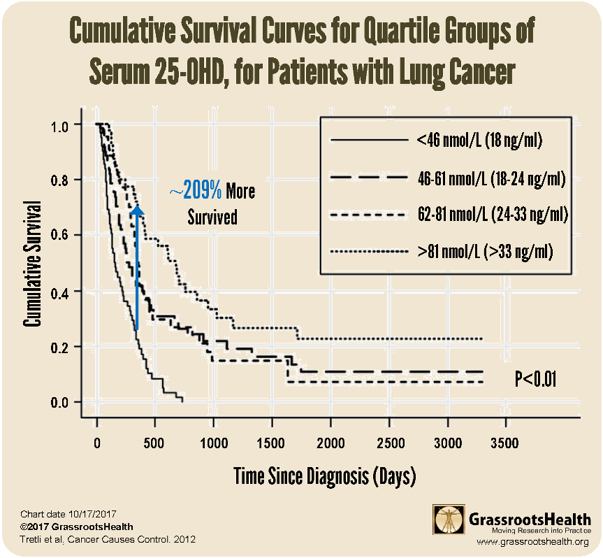
A group of researchers studied 658 Norwegian patients diagnosed between 1984 and 2004 with either breast cancer, colon cancer, lung cancer or lymphoma. Blood levels of vitamin D (25-OHD) were determined within 90 days of diagnosis, and subjects were followed until 2008. Researchers monitored for death. The analysis divided patients into four vitamin D groupings of roughly equal size and plotted survival over time for each of the different groups.
Notice the highest survival rate is achieved by the group with the highest vitamin D level, over 33 ng/ml (81 nmol/L).
Which group would you prefer to be in? What is your level?
How to read these charts
These types of charts are called Kaplan-Meier plots and we see them frequently in vitamin D research around disease states. They use a standard method to plot survival rates over a period of time. The goal is to remain as close to 1.0 (the top) as possible. You can think of the 1.0 line as the water line of a pool, and you want to swim on top of the water as long as possible. We have presented similar charts in the past, notably, the first chart on this page shows the rates of trial participants who remained cancer free in a vitamin D randomized controlled trial.
Other charts from this paper may be found here
References
Serum levels of 25-hydroxyvitamin D and survival in Norwegian patients with cancer of breast, colon, lung, and lymphoma: a population-based study
Steinar Tretli et al.
Cancer Causes & Control
February 2012
Read Paper
